
In the last two posts we covered JSX and Props, now it’s time to move forward in our journey in React and the next stop is styling the components. There are various ways to style a component in React :
We will cover all these topics and will also have a look at applying styles based on conditions.
Inline styles
Inline style in HTML looks something like this:
<p style="color: green" >This text will be green</p>
The same can be achieved with JSX. In JSX, instead of passing the style as a string we pass it as an object.
<p style={ {color: 'green'} }>This text will be green</p>
We use {} braces to pass a value to a prop, this is exactly what we are doing, we are passing value to the style prop. To demonstrate this we can write the above example as:
const pTagStyle = {color: 'green'};

<p style={pTagStyle}>This text will be green</p>
Let’s see some more CSS properties:
<p
  style={ {
    padding: 20,
    margin: '20px 15px',
    fontSize: '2rem',
    color: 'darkorange',
    border: '1px solid darkgrey',
  } }
>
  Multiple CSS Properties
</p>
Lot of things going on there:
- We have to pass values as strings
- If you want to pass a
pxvalue to a CSS property just pass the number value. Like we are doing forpadding. - If you have to pass multiple values with
pxthen you have to mention the whole things as a string likemargin - CSS properties that have a
-, have to be written in camel case. That’s why we havefontSizeinstead offont-size. Another example would be, if we want to use themargin-bottomproperty, we will have to writemarginBottominstead. - We can pass multiple values as a string when required like the
borderormarginproperties in our example.
Lastly we can have a look at assigning a value to a CSS property based on a condition. Here is an example
<p style={ { color: isActive ? 'yellowgreen' : 'darkgrey' } }>
  Based on condition
</p>
In the above example we are setting the color property based on a condition. While this is an amazing feature, the disadvantage of this is that we have to use the condition on every property. Classes would be very helpful here.
CSS files
Out of the box, CRA supports importing CSS files. We can import a CSS file directly into our component and all the classes defined in our CSS file will be available to us in JSX.
And it’s very easy too. Make a CSS file and import it into your component.
Let’s say we have a CSS file called CssFileComponent.css.
.wrapper {
  background-color: antiquewhite;
  padding: 15px;
}

.greenText {
  color: green;
}

.multiple-properties {
  padding: 20px;
  margin: 20px 15px;
  font-size: 2rem;
  border: 1px solid darkgrey;
}

.active {
  color: blue;
  cursor: pointer;
}

.disabled {
  color: grey;
}
It’s just a CSS file, nothing fancy.
Next, import this CSS file into our component file
import React from 'react';
import './CssFileComponent.css';

const CssFileComponent = ({ isActive }) => {
  return (
    <div className="wrapper">
      <p className="greenText">This text will be green</p>
      <p className="greenText multiple-properties">Multiple classes</p>
      <p className={isActive ? 'active' : 'disabled'}>Based on condition</p>
    </div>
  );
};

export default CssFileComponent;
Few things going on here:
- We have imported the CSS file directly into our component and then use our classes.
- Using
classNameinstead ofclasswhen we have to apply a CSS class. Why do we have to do it? Short answerclassis a keyword in JavaScript, and our components are JavaScript functions hence we can’t use it, but to get a better understanding you can read this post on Quora. - We can apply multiple classes to an element, just like in HTML.
- We can also apply classes based on a condition.
SASS files
SASS stands for Syntactically Awesome Stylesheet.
Sass is a stylesheet language that’s compiled to CSS
You can read more about SASS, on it’s official page.
To start using SASS in a CRA project we will have to install one dependency node-sass. CRA takes care of rest of the things for us.
Run the following command in your project directory:
npm install node-sass or yarn add node-sass
Once the installation is done we can start using SASS in our project. SASS files have .scss extension. Here is an example of a .scss file let’s call it SassStyleComponent.scss.
@import './variables.scss';

.sass-wrapper {
  display: flex;
  padding: 20px;
  border: 1px solid $secondary-color;
}
ul {
  margin: 0;
  padding: 0;
  list-style: none;
  li {
    display: inline-block;

    a {
      display: block;
      padding: 6px 12px;
      text-decoration: none;
      color: $primary-color;
      &:hover {
        color: $secondary-color;
      }
    }
  }
}
SASS helps us write CSS in a more intuitive way.
- We can import styling code from other files.
- Styles can be nested as per our markup, like in our example.
ul->li->a. - Pseudo-classes can also be nested, like in our example
:hoveris nested insidea.
And here is the code for the variable.scss file we are importing. This file holds two variables that can be used by importing in any other SCSS file.
$primary-color: #b2d534;
$secondary-color: #ff8c00;
Now to use this in our component file.
import React from 'react';
import './SassStyleComponent.scss';

const SassStyleComponent = () => {
  return (
    <div className="sass-wrapper">
      <ul>
        <li>
          <a href="https://dsouzaalf.red/">This is a link</a>
        </li>
        <li>This is not a link</li>
      </ul>
    </div>
  );
};

export default SassStyleComponent;
We import the scss file just like we would a css file. CRA takes care of compiling SASS down to CSS for us. In the component, things don’t change. We can use the styles defined in our scss file.
CSS modules
With CSS modules we can define styles that are scoped at component level. This is useful as this solves the problem of styles defined using css or scss file being global and applied to all components.
CSS Modules allows the scoping of CSS by automatically creating a unique classname of the format [filename]_[classname]__[hash].
CRA supports CSS modules out of the box. To start using CSS module use the following naming convention [name].module.css.
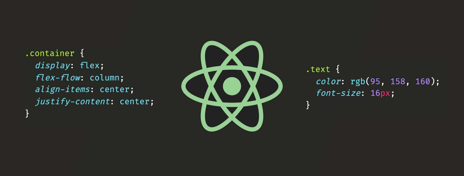
Let’s create a CSS module file and call it CSSModule.module.css.
.container {
  display: flex;
  flex-flow: column;
  align-items: center;
  justify-content: center;
}

.text {
  color: rgb(95, 158, 160);
  font-size: 16px;
}
Let’s see how to include this file into our component.
import React from 'react';
import styles from './CSSModule.module.css';

const CSSModuleComponent = () => {
  return (
    <div className={styles.container}>
      <p className={styles.text}>Test</p>
    </div>
  );
};

export default CSSModuleComponent;
We get a JavaScript object style from CSS module, hence we have to specify what we want to call this object. I have called it styles you can call it anything you want.
Inside this object we will have access to all our classes.
If you have a look at the DOM using the browser dev tools, our component will look something like this.
<div class="CSSModule_container__2iMh-">
  <p class="CSSModule_text__37hvW">Test</p>
</div>
Note that I had named the component CSSModuleComponent.js hence the first part of the class name.
We can combine the power of SASS and CSS modules. Make sure you have node-sass installed as a dependency and name the file .module.scss instead of .module.css.
Styles based on conditions
Earlier in this post we had seen how to apply classes based on a condition. But what if we have multiple conditions instead of one. For example we have a Alert component and this component takes in two props text and type. Now type can be success, error or warning.
Let’s start with the component first.
import React from 'react';

const Alert = ({ text, type }) => {
  return <div>{text}</div>;
};

export default Alert;
A simple component that takes in the text for the alert and the type of the alert.
And now the CSS.
.container {
  display: flex;
  flex-flow: column;
  align-items: center;
  justify-content: center;
  padding: 20px;
}

.alert-success {
  border: 1px solid green;
  color: green;
  background-color: greenyellow;
}

.alert-error {
  border: 1px solid red;
  color: red;
  background-color: salmon;
}

.alert-warning {
  border: 1px solid orange;
  color: orange;
  background-color: orangered;
}
We have a default container style and one class for each type of alert.
We can handle the condition inside our component like this:
import React from 'react';
import './Alert.css';

const Alert = ({ text, type }) => {
  const classToApply = (type) => {
    if (type === 'success') return 'alert-success';
    if (type === 'error') return 'alert-error';
    if (type === 'warning') return 'alert-warning';
    return '';
  };

  return <div className={`container ${classToApply(type)}`}>{text}</div>;
};

export default Alert;
And this works perfectly fine but we will have to write these conditions in every component we want to have classes based on conditions. Or we could use the clsx npm package to help us with it. clsx allows us to apply classes based on conditions.
First let’s install clsx as a dependency in our project.
npm install clsx or yarn add clsx
Next we update our Alert component to use clsx.
import React from 'react';
import clsx from 'clsx';
import './Alert.css';

const Alert = ({ text, type }) => {
  return (
    <div
      className={clsx('container', {
        'alert-success': type === 'success',
        'alert-error': type === 'error',
        'alert-warning': type === 'warning',
      })}
    >
      {text}
    </div>
  );
};

export default Alert;
We have a default class container that is always, applied. The other three classes are applied only if they meet a condition.
CSS-in-JS libraries
CSS-in-JS libraries let you write CSS using JavaScript syntax. They allow you to write CSS in the same file as the component file and they abstract CSS to the component level.
There are quite a few libraries that can be used to write CSS-in-JS.
We will have a look at styled-components.
We will start by installing styled-components:
npm install styled-components or yarn add styled-components
And now let’s dive into writing a component using styled-components.
import styled from 'styled-components';
import React from 'react';

const Container = styled.div`
  display: flex;
  flex-flow: column;
  align-items: center;
  justify-content: center;
`;

const Text = styled.p`
  color: rgb(95, 158, 160);
  font-size: 16px;
`;

const ScComponent = () => {
  return (
    <Container>
      <Text>Not Primary</Text>
    </Container>
  );
};

export default ScComponent;
Container and Text are components we define using styled components. As you see we are using CSS in JS.
Component style can be changed based on props:
import styled, { css } from 'styled-components';
import React from 'react';

const Container = styled.div`
  display: flex;
  flex-flow: column;
  align-items: center;
  justify-content: center;
`;

const Text = styled.p`
  color: rgb(95, 158, 160);
  font-size: 16px;

  ${(props) =>
    props.primary &&
    css`
      color: rgb(177 218 54);
      font-size: 18px;
    `};
`;

const ScComponent = () => {
  return (
    <Container>
      <Text>Not Primary</Text>
      <Text primary>Primary</Text>
    </Container>
  );
};

export default ScComponent;
There are other ways to style component, like using a TailwindCss which is utility-first CSS framework. Tailwind gives us utility classes that we can use in our components. It comes with a lot of configuration and theming options.
Another option is to use a component library, like Material UI. Material-ui is based on google’s material design, it provides a lot of ready made components which we can use in our App. It also comes with hooks for styling and theming.
We have covered quite a lot in this post, until next time take care :).
Lastly you can find the code on github.